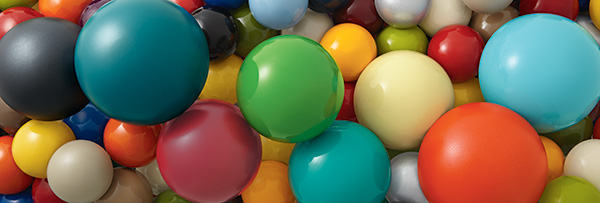
You may have seen that we introduced eight new colors to make your playground designs pop, blend in or tell a unique story. But with all the infinite number of colors available, how did we choose peacock, buttercup, sky, grass, berry, lagoon, paprika and carbon?
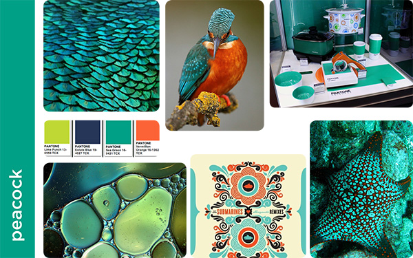
A team of five playground designers looked at a cross-section of trends—built environments, graphics and fashion design—in addition to nature to find colors that excite, but will also stand the test of time. They each created mood boards to identify what they felt were “gaps” in our current color offerings. And after seeing similarities among the boards, they began to move forward with colors they felt would complement our existing playground colors and offer the most variety in color palettes.
The team then ordered paint swatches to study how the sun affected the colors and to see which new hues would be most complimentary to existing color options. According to Nikki Hall, playground designer, “Seeing the swatches in the sunlight dramatically changed how the colors interacted, so this was an important step in the process.” Going even further, the team came up with the idea to carbonize some of the colors to give it a richer finish.
So what about the names? “We wanted all of the names to be something authentic from nature—nothing artificial or made-up,” explained Allison Schrein, playground designer. “We generated lists, and threw ideas and more images back and forth to each other until we found ones that seemed right.” Most of the names that the team started with early on in the process are ones that stuck.
Do you have a favorite of the 2015 new playground colors? What do you think of the 23 curated palettes? Share your thoughts below, then visit playlsi.com to learn more.


